Usability
Modified:
2026-04-21 (21:46 CDST)
Many web pages neglect users or force them to hunt hard for
information. Designers of web pages could easily create pages that
are easier to navigate, find, and view. Usability is the art, craft,
and science behind making web pages better for users. Below, we will
examine user-driven usability, usability testing companies, usability
conferences, date consistency, tablets, smartwatches, and voice command interfaces. Usability, of course, is not just limited to web pages. All kinds of devices, real or virtual, can be made better by applying the rules of usability. UX is often used as shorthand for "User Experience."
Usability Testing Companies. Here are some companies that
specialize in usability testing. Such testing is not cheap, but can
easily pay for itself in additional business.
- Human
Factors International, Inc. (Fairfield, IA)
- Take a look at their front page, note some of the biggest links in their word cloud: Hick-Hyman Law, Yerkes-Dodson Law, Signal Detection Theory, and Orienting Response. Let's take a look at each:
- Hick-Hyman Law--Response slows down the more choices there are
- Today, notice how many choices there are online and in store
- Yerkes-Dodson Law--Optimal levels of arousal are best for human performance
- Too much or too little arousal inhibit human performance
- Optimal arousal is usually in between too much or too little
- Signal Detection Theory--There are always four possible outcomes for perception:
- correct acceptance: train signal on, train coming, you stop
- correct rejection: train signal off, train not coming, you go
- false acceptance: train signal on, train not coming, you stop
- and false rejection: train signal off, train coming, you go
- The stronger the signal is compared to the noise the less likely is making a mistake
- Orienting Response--Pavlov discovered it, organisms first must notice a stimulus before conditioning can begin.
- When nothing happens (e.g., conditioning not established) after an orienting stimulus is is extinguished.
- So, if no food were to follow Pavlov's metronome, then the metronome would not become a CS (conditioned stimulus).
- Da Vinci Usability
(Lexington, MA)
- Look at their site. They start with a very important principle: "We have a passion for building exceptional digital experiences."
- They suggest:
- Solve the problem
- Start from user needs
- Involve users at every step
- Iterate: Start simple and evolve designs based on user feedback
- Unfortunately there are too many web sites and apps that do not follow that rule.
- Instead, those bad sites force users to adapt to the creator's way of thinking or doing the job.
- A Google search yielded about
349,000 hits in 2002, 7.65 million in 2010, 35.5 million in 2017, 60.3 million in 2020, 89 million in 2021 and 187 million in 2022 for "usability
services"
- A Yahoo search in 2024 yielded 2,600,000 hits
- A Yahoo search in 2025 yielded 7,810,000 hits
- A Google search in 2026 about 189,000,000 hits
- So, there is a demand for usability out there
- It's a big business, and expensive too
- Nielsen Norman Group
- Jacob Nielsen and Donald Norman founded the group
- Both are UI and UEx gurus
- Training is expensive and is now exclusively online and live
- One course costs: $1190
- Their site has many pages devoted to good practice in interface design and user experience. See Articles and Videos
- Mobile vs. Full Site One of my pet peeves (as you already know) is the lack of user switchability between a standard web site (on designed for a computer screen) and an app web site (one designed for a smartphone).
- The article above suggests that mobile users should be directed to a mobile web page or app
- It also suggests that a minority (like me) would like to direct themselves back to the main web page
- Tablets should probably be directed to the main page or have their own tablet page
- I would like all app sites to have a provision to let the user see the standard site if desired. SAU's app site does not.
- The key here is that different hardware requires different software
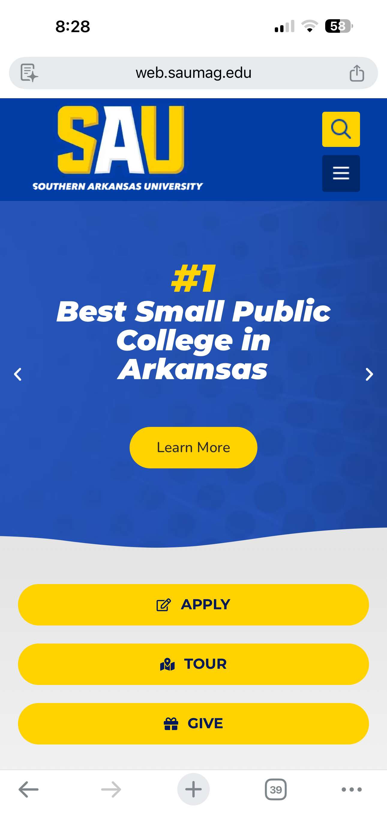
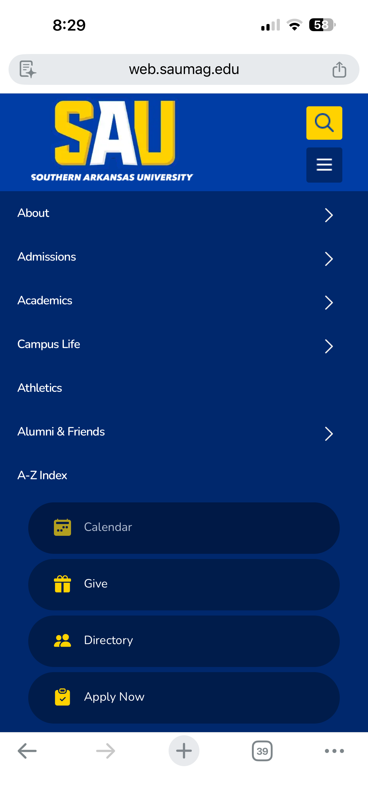
- SAU Mobile Site
- The Coronavirus notice took up space for other buttons: (not shown) Calendar, Give, Directory
- Now, those buttons are not on the front page
- Scrolling down shows links for:
- Future Students>Degree Options>Cost Calculator>Scholarships and Financial Aid>Housing>BAM Orientation
- Current Students>Student Life>Housing>Dining>Mulerider Activity Center>Magale Library>Blackboard>Campus Calendar>Bookstore
- Parents & Visitors>Campus Tour and Map>Event Calendar and Academic Calendar>Parent Resources>Let's Talk Video Series>Parking
- Alumni & Friends>Stater Magazine>Alumni Association>SAU Foundation>Office of Development
2025


2026

- 3. User control and freedom
- Undo, Redo, and Cancel buttons are a must!
- 4. Consistency and standards
- Consistency improves learnability
- 5. Error prevention
- Slips come from users inattention
- Mistakes are conscious and result from mismatch of user's expectations and web page design
- "highway guardrails" are a good metaphor for avoiding slips
- highway design itself prevents many driver mistakes
- FYI: when my children were in driver ed the instructor did not take them onto the Interstate right away.
- Interstates are designed to prevent drivers from making mistakes.
- The most common accidents on Interstates are rear-end collisons.
- On other roads, most accidents take place at intersections.
- Highway signs (video uses NJ)
- How is this an example of error prevention?
- 6. Recognition rather than recall
- Name the starting team for the 1961 NY Yankees. That's a recall task (think essay test) and most will not remember all of the players
- Was Mickey Mantle on the 1961 NY Yankee team? That's a recognition task (think multiple choice test)
- FYI: I was 12 in 1961 and a Yankees fan (not now though). That was when Maris and Mantle dueled it out trying to beat Babe Ruth's 1927 record of 60 home runs in a season.
- On a a web page it is better to SHOW users (recognition) than to make them REMEMBER (recall)
- 7. Flexibility and efficiency of use
- Experienced users should have access to accelerators (short cuts or touch gestures)
- The interface should be personalizable and customizable
- FYI: Here's an analogy using a target pistol. That shooter might paint the front sight red, install adjustable rear sights, and install comfortable grips
- The one below has an optic on top, a compensator on the barrel, and a flared entry point at the bottom of the grip

- 8. Aesthetic and minimalist design
- Focus on essentials
- Put important items higher in design hierarchy
- 9. Help users recognize, diagnose, and recover from errors
- Make error message easy to read and prominent
- Write them in language users can understand
- For example, Error 404 is not easily understood (that's a common web error, btw, Page Not Found)
- 10. Help and documentation
- Good design should eliminate the need for documentation
- But, complex programs or apps may require some user training
- FYI: Mac users (like me) typically never read documentation when first interacting with a new application because Apple forces developers to standardize their interfaces.
- BUT, I recently destroyed an AirTag because it needed a battery replacement and I DID NOT read the directions!
- How to replace AirTags battery (video)
- Usability 101: Introduction to Usability Covers the basics of usability including:
- 1. Definition includes:
- learnability,
- efficiency,
- memorability,
- errors,
- and user satisfaction
- 2. Utility: does it do what users want?
- Does it have needed features?
- Is it easy and pleasant to use?
- 3. Important to: e-Commerce, employee productivity
- Usability is important to the survival of the web page
- 10% of designers effort should be directed to usability
- 4. Improve by testing users and tasks
- Use representative users and representative tasks
- All designs should be tested with potential representative users
- 5. Improve site by:
- testing old design
- conducting field studies
- using paper prototypes (see ours from 2004 below)

- keep refining the design
- testing along the way
- testing the final design
- never stop testing
- Digital.gov on Usability
- Defines usability: How easily and effectively people can accomplish their goals using a product or system, while having a positive experience.
- Digital.gov covers a wider range of topics:
- Delivering digital-first public experienc
- Domain management
- Typography
- Privacy
- Digital governance
- Search optimization for PDF documents
- Optimizing search during website redesigns
- The United States government is also a purveyor of UI and UEx (User Experience) advice.
- Their OLD site has(thanks to the University of North Texas) links for:
- Methods Provides overview of:
- project management,
- user research,
- usability evaluation,
- information architecture,
- UI design,
- interaction design,
- visual design,
- and content strategy.
- (Note how it asks for feedback at the bottom of page.)
- Templates and Documents Has a long list of templates and documents to look at. (Why reinvent the wheel?)
- Recruiting Participants and the Legend of "The General Public" Argues that designing for the "general public" is a bad idea.
- Instead research exactly who the page's intended audience will be.
- Know their:
- age range,
- gender,
- ethnicity,
- education,
- language,
- technical familiarity, previous usage of the page,
- hardware and software necessary,
- internet access,
- and other special issues such as:
- job history,
- health history,
- personal history,
- living environment,
- familty environment (e.g., married, children).
- Think about these web pages, who did I write them for?
- What assumptions did I make? (This will be a short answer question.)
- Content Strategy"Focuses on
- planning,
- creation,
- delivery,
- and governance of content
- Divides strategy into content-oriented:
- messaging architecture,
- audience,
- voice,
- tone,
- and structure
- People-oriented components:
- roles,
- workflow,
- policies,
- and standards)
- Project Management Deals with management of:
- scope,
- time,
- cost,
- quality,
- HR (human resources),
- communication,
- risk,
- and procurement.
- Basics of User Experience Any site should be:
- useful,
- usable,
- desireable,
- findable,
- accessible,
- and credible.
- Visual Design Basics The elements of visual design include (and see graphic below):
- lines
- shapes
- colors
- texture
- typography
- form
- Good visual designs incorporate:
- Unity
- Gestalt (pleasing perception)
- Space
- Hierarchy
- Balance
- Contrast
- Scale
- Dominance
- Similarity
- Below is an example from their page of those points.

Usability Conferences. Here are few upcoming conferences in
the area of usability.
- User Experience
NielsenNorman Group has moved to virtual delivery following the pandemic. Prices are high: $1235course if you apply early.
Date consistency. An international problem in usability is
the wide variety of methods for citing dates.
- International
Date and Time Notation--long discussion of ISO 8601:2000, a
document which specifies an international agreement on date and
time notation. Note the dates on this page, btw. The world mostly uses 24 hour notation, btw.
- ISO 8601 strives for wordwide consistency.
- Dates should be: YYYY-MM-DD
- Times should be represented as: hh:mm:ss
- Note that my pages do not show time that way, but this page does. Soon, I'll convert all mine to hh:mm:ss and use 24 hour clock
Tablets. Apple created a new market for tablets with its iPad. How does tablet design and usability interrelate? The first article notes that tablets are useful in displaying graphic material and good for short term use. Users prefer laptops for longer term use.
Smart Watches. Watches are the number5one example of wearable computing. Many of you likely have a smart watch of some kind. I wear my Apple Watch during the day and my now YouTube famous analog Seiko at night.
- Best Smart Watch 2026
- Apple Watch Faces
- My Apple Watch
- Was essentially free (it was a reward from EF for leading three student travel tours: Cuba, Paris, Iraly)
- I'm still wearing my self-winding Seiko at night (while the Apple Watch charges)
- Oh, I had to get a new iPhone too (iPhone 11 Pro). My old iPhone (iPhone 6) would not work with Apple Watch 5.

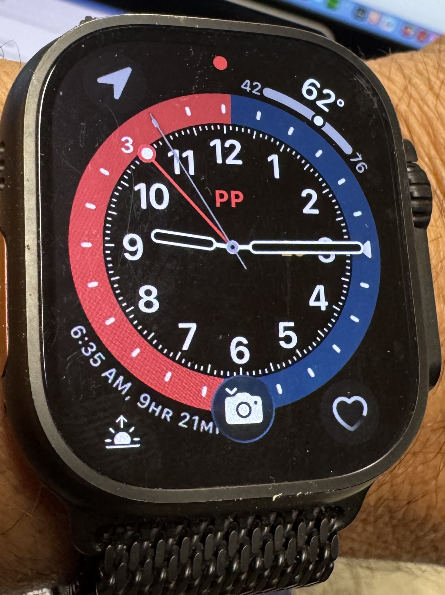
- My Apple Watch
faces. I'm not taking guitar lessons, fyi. I like the four complications I have installed on old watch (clockwise from upper right corner): weather, date, sunrise/sunset, map.
- On the the new watch I replaced day/time with heart monitor.
- Note that is is a highly customizable interface.
Complications are an old watchmaker's term for added bits of information that could appear on the watchface. Those old complications, of course, were mechanical and added time, effort, and money to their creation. Apple's complications are software and include those available from Apple and from third-party vendors. All of the ones I have installed came from Apple.
Remote Control Design. Yes, I know, I can't stop writing about this horrible interface. Please bear with me. We bought a big Sony TV when the kids were young. The first thing I did was to lock up its remote so they could not crash the TV. If your house is like mine you have more than one remote needed to control the TV, the cable, and whatever other devices you have connected.
- The Darth Vader Remote (video)
- That's the remote I want: Just open hand and remote flies to it.
- Remotes are changing (video)
- Why are Remote Controls so Awful
- I've always wanted to give couples who fight over what to watch on TV one remote control each :-) Imagine what would happen.
- There was a tech savvy cognitive science student in this class some years ago who carried a universal remote control with him and he would change stations in public places. Let's hope he's not in jail now :-)
- The article states, "The real history of the remote control, then, is one of competing impulses--to take control of your television and to never leave your couch"
- Roku Voice Commands (video)
- Roku's remote control for smart TVs has been praised for its simple and practical design
- The Rise and Fall of the Smart Remote
- Discusses how Logitech and others attempted to make one remote to rule them all
Voice Interfaces. Just FYI, I only use Siri but not very often. Usually, when I really need it the interface does not work that well. Voice interfaces are often abbreviated as VU or VUI.
- VUI: The future of voice interface design explained
- Becoming more common in online searches
- Users "want their devices to recognize their commands instantly, without mistakes."
- VUI has not yet reached the level of humans to comprehend voice messages.
- Devices (phones, wearables, desktops) are each different in their VUI constraints
- VUI triggers can be vocal, haptic (interacting with a button or dial), motions, scheduled
- VUI interface scripts needed to handle vague user input
- Alexa (Video)
- Amazon video describes Alexa and the "skills" developers have created
- Alexa system works with a variety of hardware devices
- Alexa commands
- Very long and routinely updated list of Alexa commands
- All start with user saying "Alexa" followed by the command
- Examples:
- Alexa, set an alarm for ...
- Alexa, send an SMS to ...
- Alexa, add eggs to my shopping list
- Alexa and privacy
- I'm not getting one.
- Prone to fail (may start recording without "Alexa" command)
- Privacy issues: Amazon is listening, your data may be sold
- Users can now erase data and manage record settings
- Alexa is Always Evolving
- CNN article discusses Alexa
- Is Alexa Spying on You?
- Siri
- Android
Back to CS